OPTIMIZING PRODUCT DISCOVERY AND ADD TO CART INTERACTIONS on Product Pages
New Design Snapshot
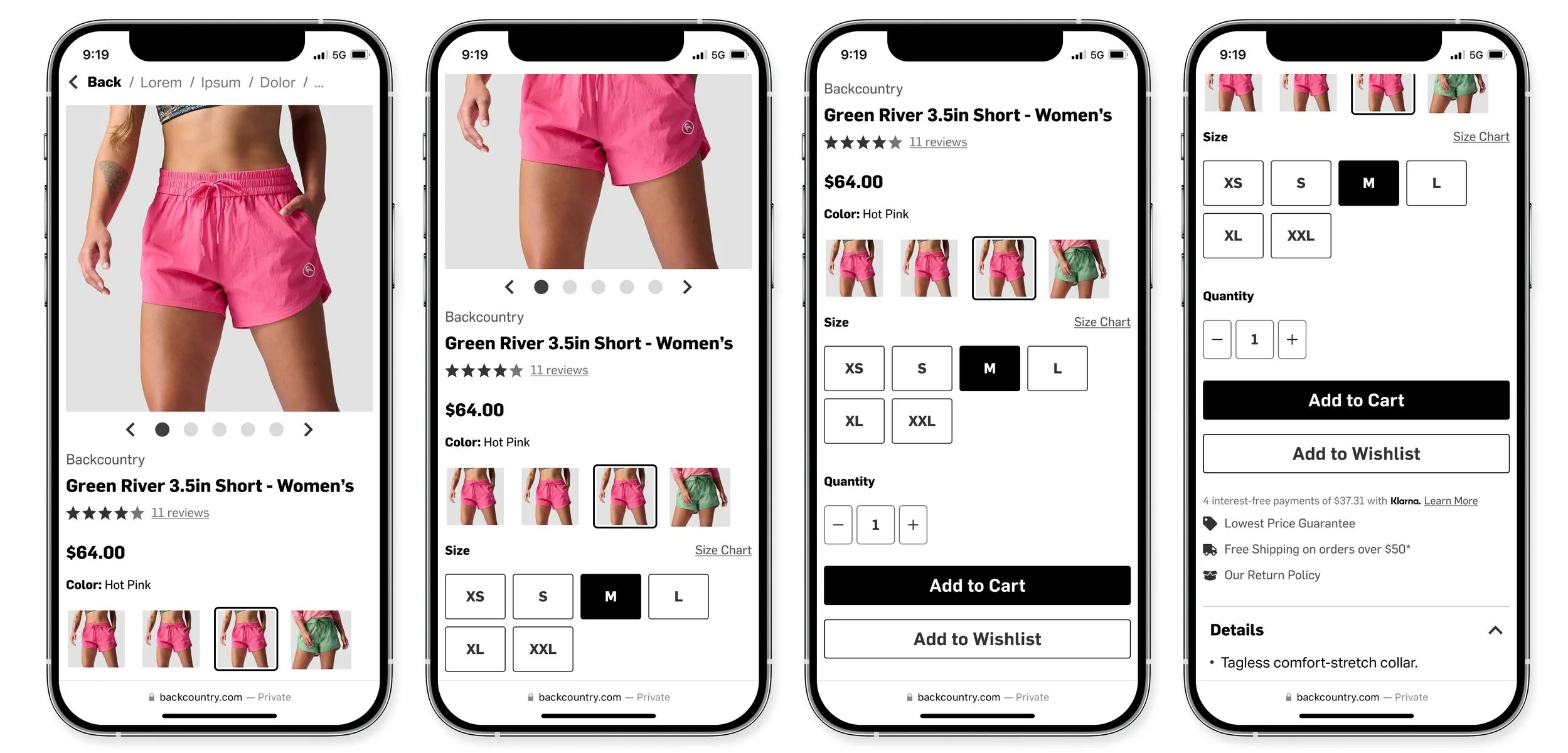
Redesigning the “buy box” on product pages to reduce user friction in the view image and add to cart experience leading to a 3.5% increase in Add to Cart rate.
Background
Backcountry
Backcountry is an e-commerce company specializing in outdoor gear, apparel, and accessories. Their mission is to connect people to their passions and the great outdoors.
Role
I was the UX researcher and designer on this project working alongside a product manager, engineering squad.
Discovery
I lead a cross-departmental User Viewing Party every other Friday to foster connection to our users directly within the product and digital organization at Backcountry. During one viewing party we noticed multiple mobile user sessions struggle to navigate our Product Pages. We watched user after user bounce up and down between selecting a color variant and viewing the product images. Within the image gallery itself, we also noticed users would rapidly swipe through the entire gallery a few times, as if they hadn’t realized they’d seen the images before.
In addition to the unintuitive behavior the gallery created, our image gallery experience was also impractical for some of our products. In the design you can see two large arrow buttons on the left and right of the image. Unpleasant, but not impractical on a product with a vertical subject like a pair of pants or jacket. It became quite impractical on products like shoes, ski bags, and other horizontal subjects - completely covering parts of the product. As a business with limited physical retail presence, we know images are a critical point to our customers decisions to purchase. In a usability test we asked 12 users what the most important and helpful information on product pages was and the #1 response was product images and videos.
It was clear there was friction in the experience affecting our mobile users and the product page was ready for a change. My product manager and I dug into the data after the qualitative evaluation and observed a steady decrease in the add to cart rate on the page over the trailing 12 months. It was time for a redesign.
Original Product Page Design
Design
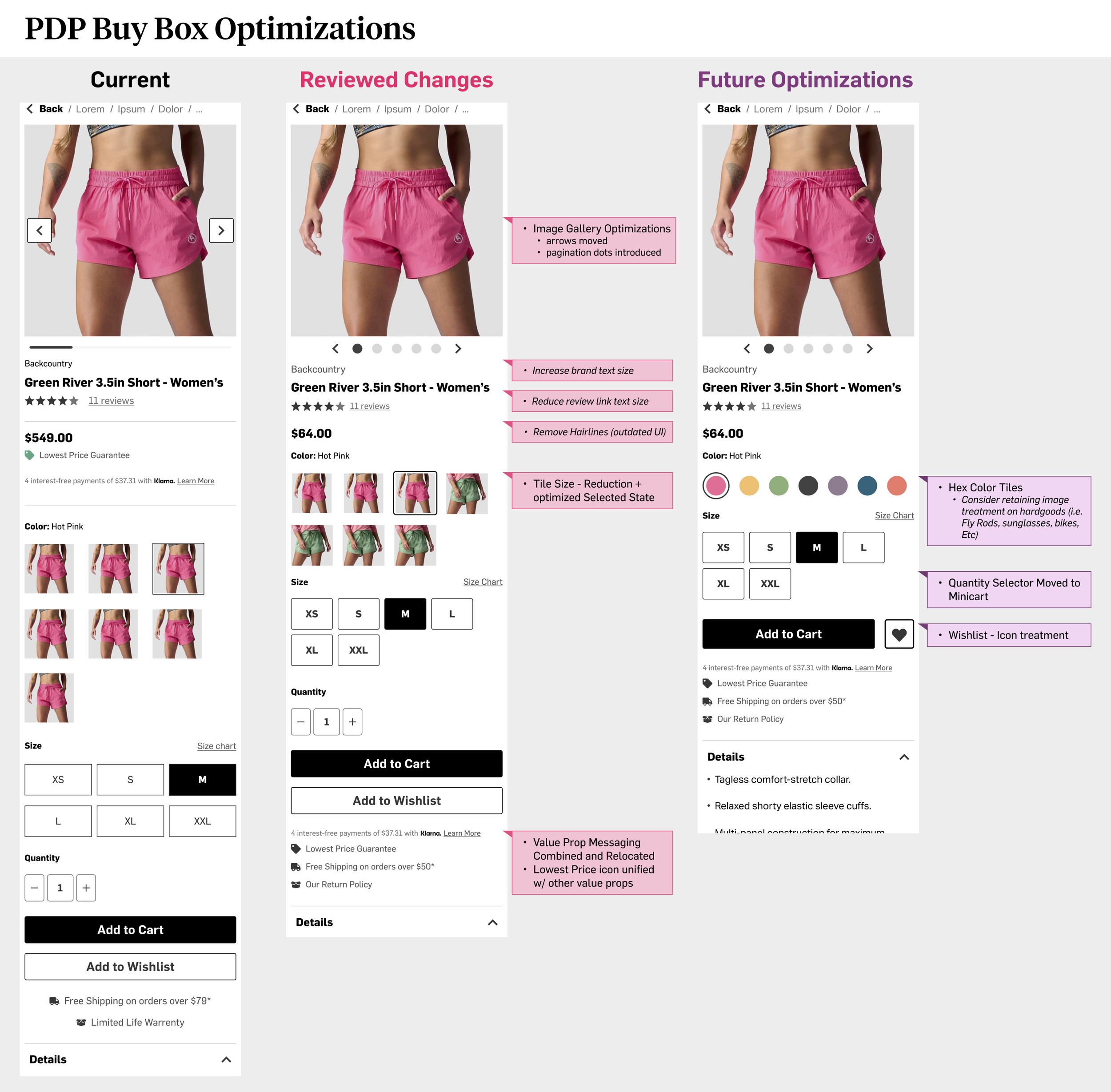
Taking a dive into the original design, there was a lot of noise between the product image and the sku selection, and a lot of over-utilized space within the sku selection area. This added noise was broken up by hairlines that were a bit outdated and wouldn’t be necessary if the information was broken out into more logical chunks.
The first order of business was consolidating the Value Props in the buy box zone. We had a product flag for lowest price guarantee - which was utilized - but it was detracting from our vision to be a premium outdoor retailer. We didn’t believe moving it below the buy box with the shipping and returns callout would hurt overall conversion because the enhanced experience would make up for any discount shoppers deterred by not seeing it front and center. We also reduced the size of our Buy Now, Pay Later (BNPL) callout and moved it to the Value Prop zone. When users select a variant, the ATC button displays the price and those on the fence will have the callout closer to their choice to proceed or not. Users who needed it would have easy access - and those who don’t wouldn’t be distracted by moving the placement.
Then we had to address the issues in the image gallery. One, the arrows were highly engaging but produced the unwanted behavior of over-scrolling, and two, blocking the view of products. Outside of usability, we noticed in the broader market a trend of social media users using product page images as a green screen background to talk about products they’re excited about and our product pages were feeling really awkward with so much of the image covered by arrows. The arrows were great for accessibility so we wanted to keep a large touch target for users who needed it but layer visual cues for how many images are in the gallery and a clearer view of the image. So, we introduced pagination dots with arrows on the end - both targets being clickable below the image and decided the natural swipe behavior on mobile would take over with the removal of arrows on the image.
Updated Product Page Design
Research
Before engineering the solution, we wanted to test our assumptions and conduced a usability test. We tested our hypothesis that users would naturally swipe through images first and engage with the arrows second and the ease of adding an item to cart with the new layout. In the image gallery interaction, we saw 6 out of 7 users swiped through the gallery and 4 out of 7 used the arrows. This affirmed our hypothesis that swiping is a natural mobile behavior. We asked users to rate the ease or difficulty of viewing images and adding to cart, they both received a very high ease of use rating (4.9 and 4.8 out of 5 respectively). We ran a subsequent test on the original page design and users scored the page’s ease of use 4.5 on average, a small but measurable improvement.
Very nice and clean website. Easy to use on mobile. - one user comment
Screenshots of the Usability Test conducted in BallparkHQ
Results
With these insights and the still unknown effect the changes may have on the BNPL conversion, we launched the changes as an A/B/C test. A being our original page, B including changes to size/color tiles only, and C including the size/color changes and moving value proposition text below ATC button. At the end of the testing period, the C variant was the clear winner improving ATC rate by 3.5%.
We monitored engagement on the value prop items we relocated and the BNPL conversion rate. While we saw a steep drop off in engagement with the BNPL placement on the PDP, we saw no change in order conversion rate with our BNPL partner. There was a small dip in engagement in the “lowest price guarantee” message but for the business this could be seen as a net positive since we increased ATC rate and reduced the number of customers calling in for price adjustments. These results made it clear - reducing distraction increases usability and better usability is better for the business.
After the test concluded we continued to monitor the qualitative success of the changes. In our session replay tool we observed smoother image gallery viewing experiences and lower rates of rapid scrolling on our product pages. Anecdotally, we also solved a social sharing problem. Users on TikTok and Instagram often share videos recommending outdoor product over a green screen of the product page. We observed users overwhelming share images without content overlays and Backcountry was rarely used as a source material. Going in to the to the 2024 holiday season, social media users in the outdoor space have begun using Backcountry screenshots in these videos.
Tools
Figma
Confluence
Jira
DXA (Medallia)
Zoom
Ballpark HQ
GA4 + Looker
Artifacts
Figma Designs - Full Mobile to Desktop Breakpoint Designs annotated in DevMode.
Design System Addition - documentation for adding the new pagination dot component to the design system.
Jira Tickets - Detailed acceptance criteria groomed with developers.
Usability Test - including the test plan, results summary, and readout deck for partners and stakeholders.
Stakeholder Review - multiple presentations outlining the discovery, design changes, estimated business value, and finally test read outs for stakeholders.
Optimizations PDF - single page view of current pdp, upcoming changes to the pdp, and a vision for the pdp for stakeholders.
Redesign on Mobile and Desktop
Overview of Changes PDF for stakeholders - Looking at Current State, Changes to be completed, and the future vision of the mobile page.


